We are TDH
About Us
In the Media
Blog
Custom Signs
Custom Signs
Channel Letters
Pylon Signs
Illuminated Signs
Monument Signs
Backlit Signs
Neon Signs
Lobby and Reception Signs
Dimensional Letter Signs
Projects
Signs & Displays
Retro & Vintage Signs
Interactive Displays
Custom Displays
Services
Contact
Service Locations
Contact
In the Pages
Featured
June 11, 2021
Preserving History Using Modern Techniques At Loggers Grill
June 11, 2021
June 11, 2021
June 11, 2021
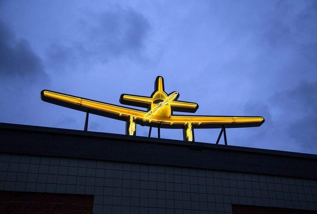
Tribute To Chilliwack Aviation Pioneer Will Light Up Liquor Store Roof
June 11, 2021
June 11, 2021
March 22, 2019
Rejuvenating a 50 Year Old Sign | Sign Media
March 22, 2019
March 22, 2019
January 16, 2018
The Return of Vintage Neon Signs | Novo Magazine
January 16, 2018
January 16, 2018
December 8, 2017
City of Vancouver unveils new neon text artwork in False Creek | The Georgia Straight
December 8, 2017
December 8, 2017
November 30, 2017
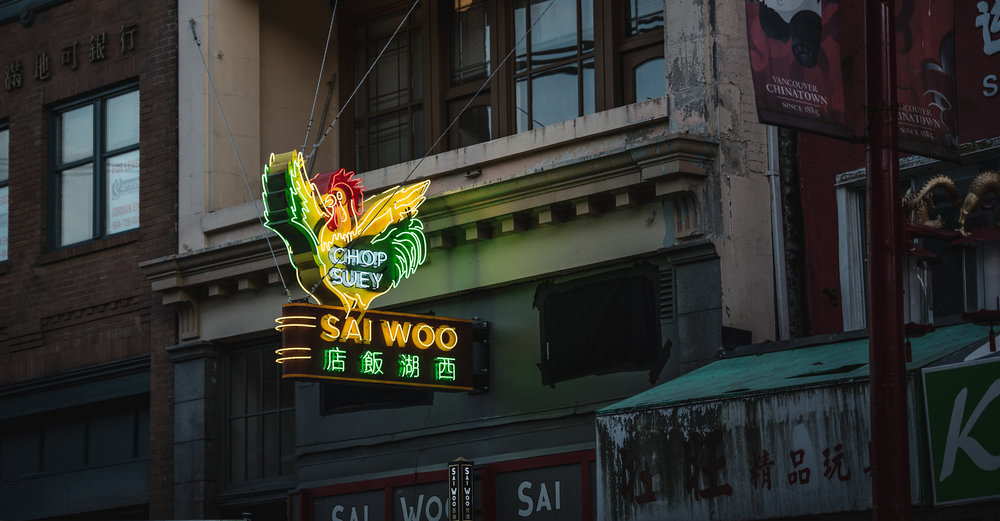
Recreating Sai Woo's Neon Rooster | Sign Media Canada
November 30, 2017
November 30, 2017
September 25, 2017
The Story Behind the Sai Woo Sign | Montecristo Magazine
September 25, 2017
September 25, 2017
August 14, 2017
Sai Woo's neon rooster sign crows over Chinatown once again. | Vancouver Sun
August 14, 2017
August 14, 2017
August 10, 2017
The resurrection of Sai Woo’s rooster | Metro Vancouver
August 10, 2017
August 10, 2017
August 8, 2017
Sai Woo’s neon bird comes back to roost in Chinatown | Vancouver Courier
August 8, 2017
August 8, 2017
On the Screen
Featured
August 13, 2017
Giant neon rooster sign sparks nostalgia in Chinatown | CBC News
August 13, 2017
August 13, 2017